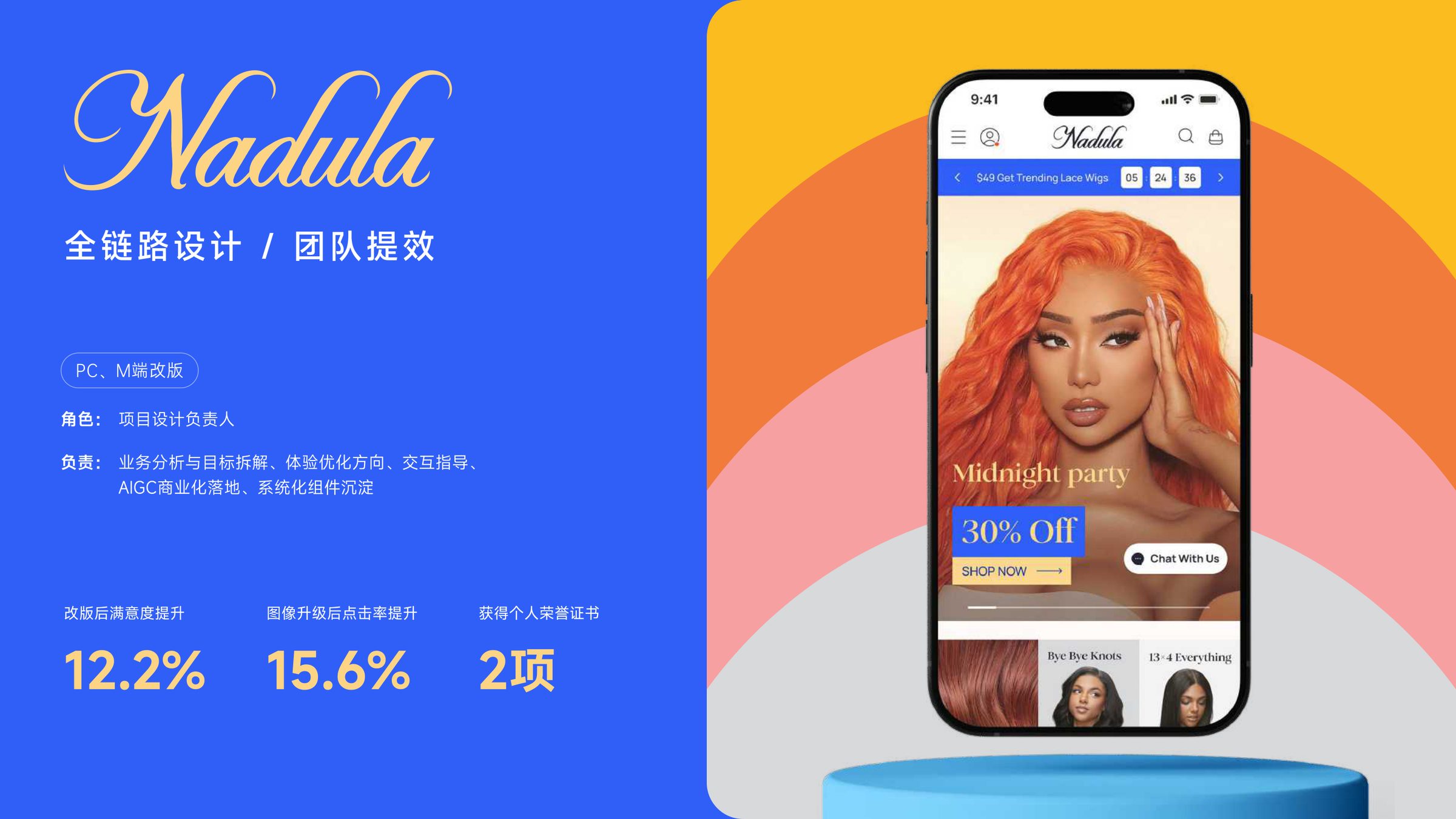
NADULA
A wig brand that stopped looking like a marketplace and started looking like itself.
- Role
- Design Lead
- Timeline
- ~1 year
- Scope
- Brand · PC/Mobile Web · Design System · AIGC Ops
- Year
- 2023 – 2024
Case at a glance
What it is, what was wrong, and what shipped — before the screenshots.
What this is
The project
NADULA is a North American DTC wig brand (millions of users, $1B+ revenue). I led a year-long redesign of PC and mobile web — brand system, purchase flows, PDP, and a 60+ component library the team still ships against.
What was broken
The problem
The site felt like a marketplace, not a house brand: inconsistent visuals, a heavy checkout, and product photos that didn't show quality — which drove returns and eroded trust.
What I did
The action
I anchored everything on three words — simplicity, consistency, quality — then rebuilt the design system, tightened IA, introduced disciplined photography, and stood up an AIGC pipeline to re-shoot thousands of SKUs affordably.
Outcomes & evidence
+12.2%
User satisfaction after launch
Post-redesign survey / product research — figures from project documentation.
+15.6%
Product image click-through rate
Analytics on PDP image modules before vs after.
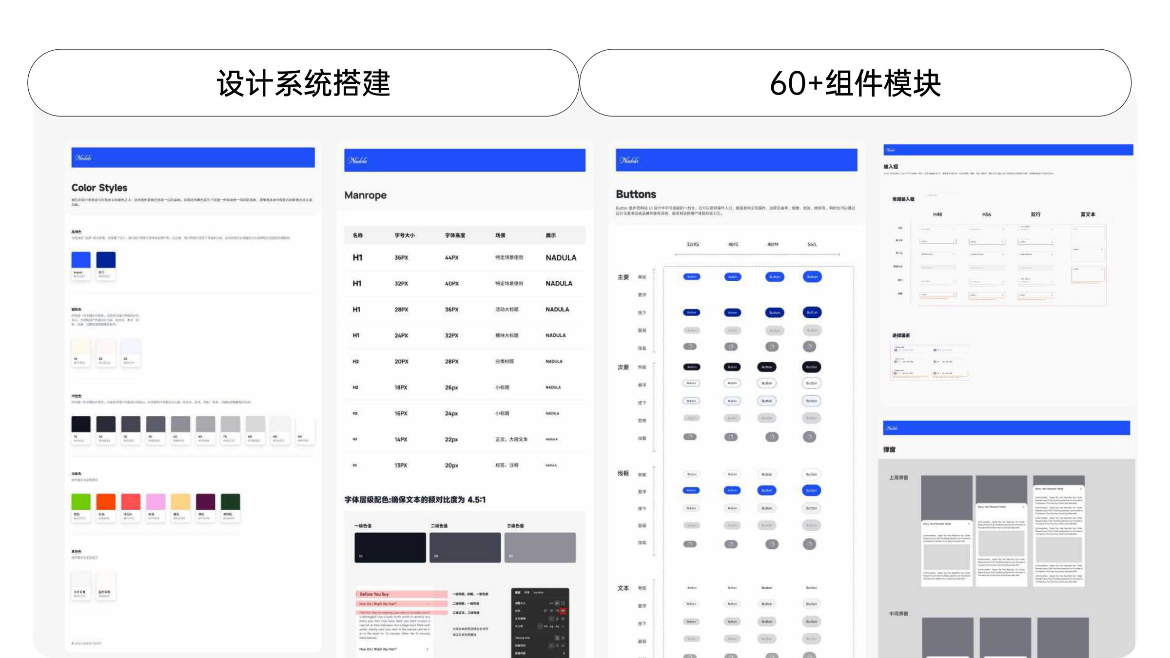
60+
Components in the shipped design system
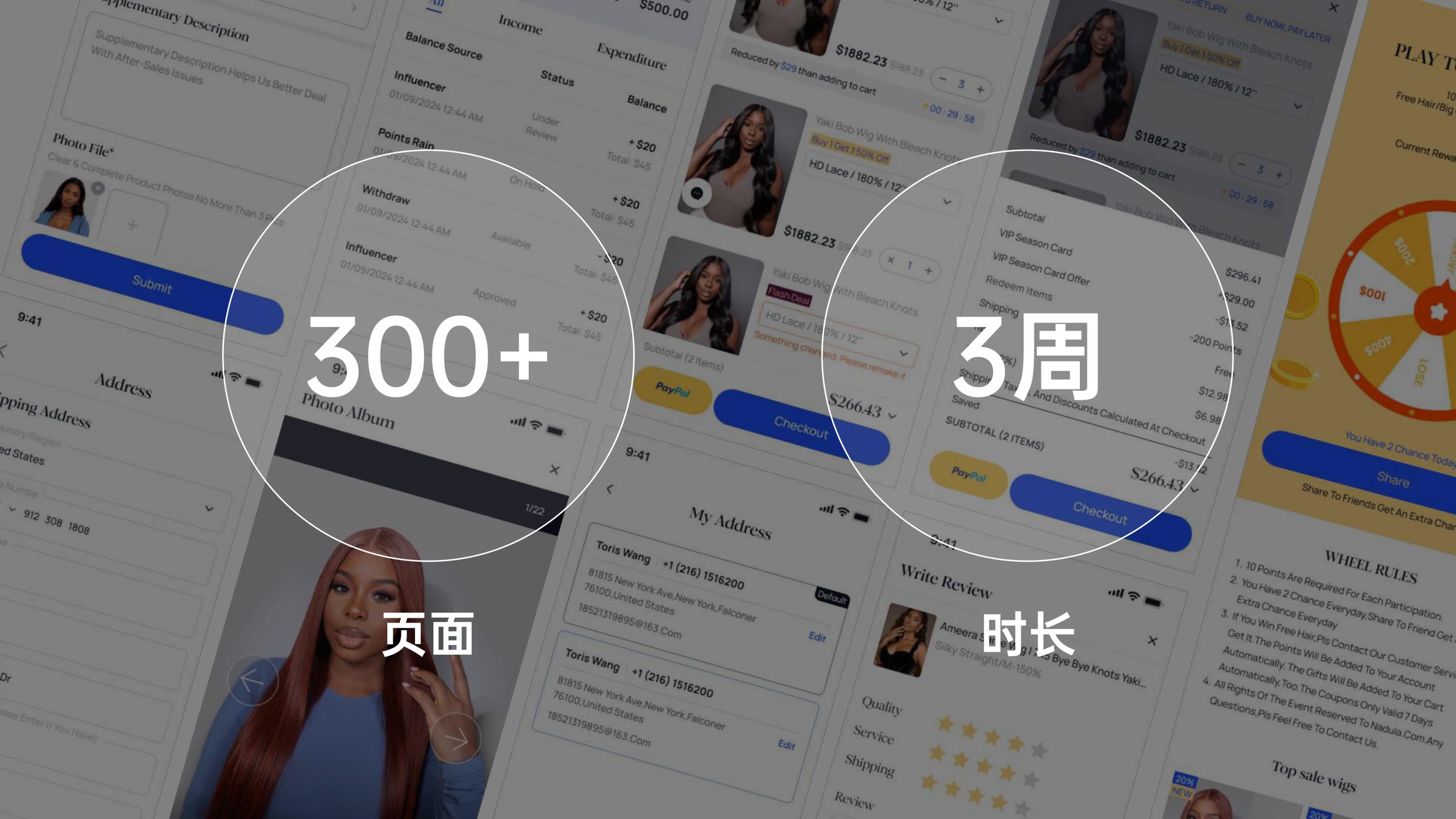
Rolled out across 300+ pages within ~3 weeks of release.
2000+
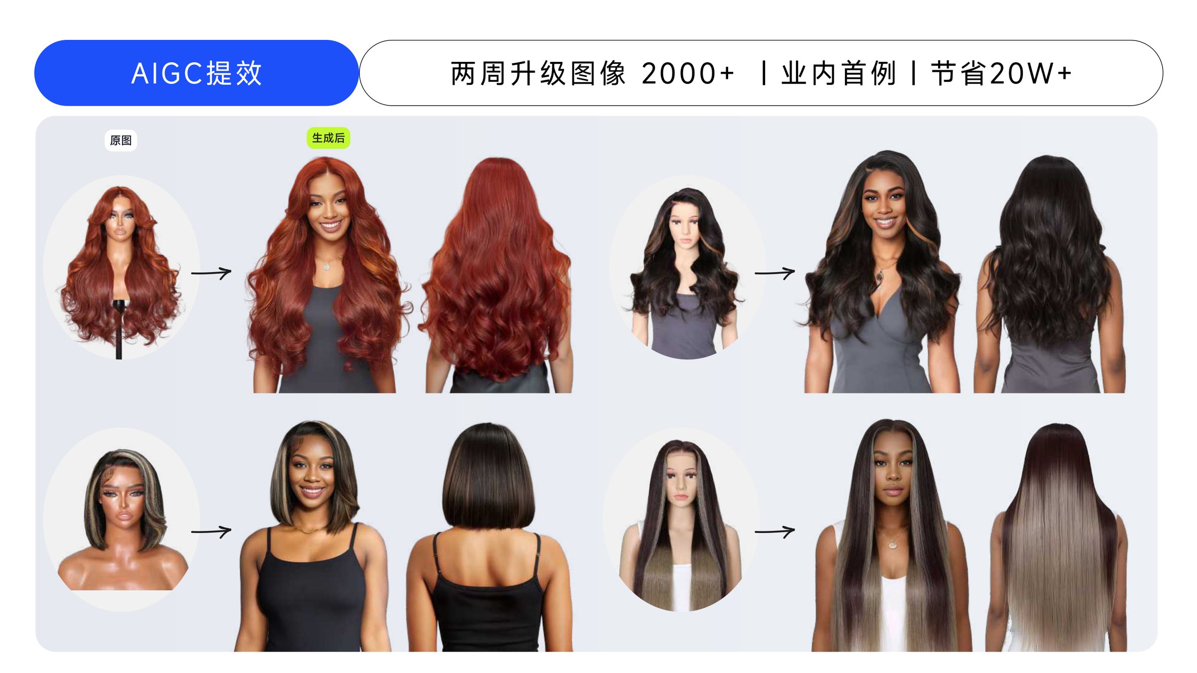
SKUs re-shot via AIGC pipeline in two weeks
Internal ops metric; ~200K+ RMB photography budget saved (project record).
Narrative — 01
Background
NADULA is a North-American DTC wig brand serving Black women aged 25–40, with millions of registered users and $1B+ annual revenue. After seven years the site had grown by accretion: every team shipped their own patterns, the social channels each ran their own visual language, and the product imagery looked more like a marketplace than a house brand.
I led the end-to-end redesign across PC and Mobile web — brand system, information architecture, purchase flow, PDP, and a 60+ component library that the team still ships against today.
Narrative — 02
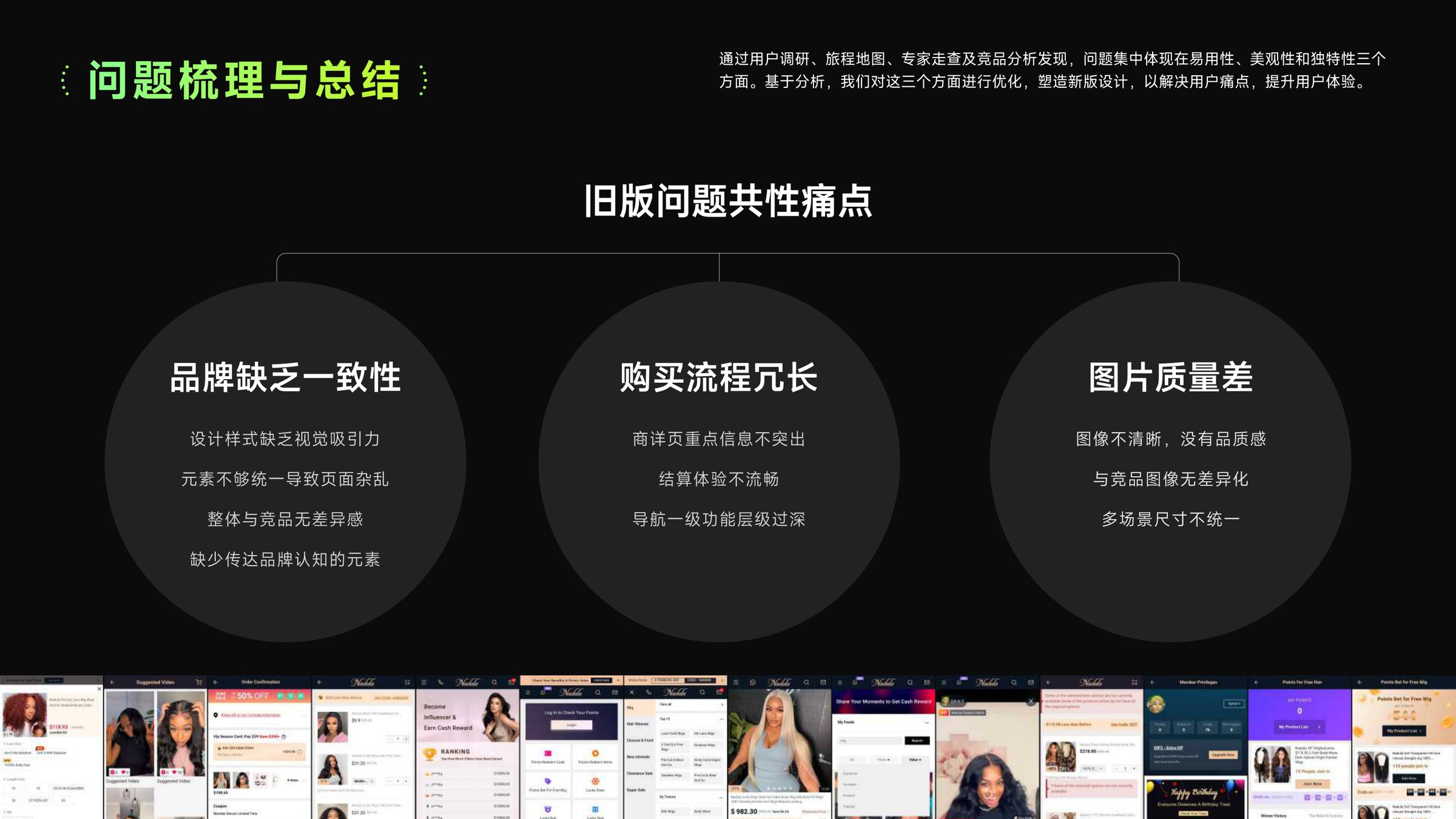
Problem
Three pain points compounded each other:
1. No brand consistency — the main site had no tonality, social channels each had their own visual rules, and users had no way to recognise "this is NADULA".
2. A heavy purchase flow — key information buried, learning cost high, checkout bloated with fields. Conversion bled in every hand-off.
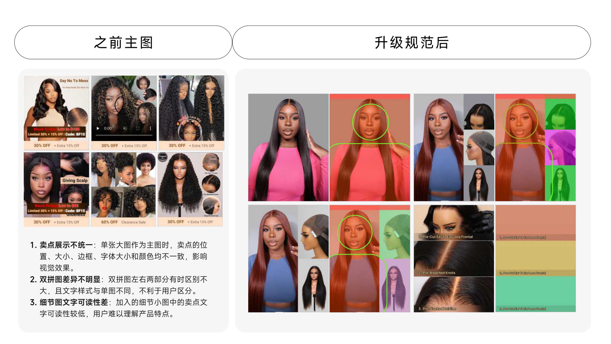
3. Low-quality product imagery — fuzzy, inconsistent sizes, no photography standard. Users couldn't see detail, so they couldn't trust quality, so they returned more.
Evidence
Screens, flows, and brand artifacts — the visual proof behind the narrative above.
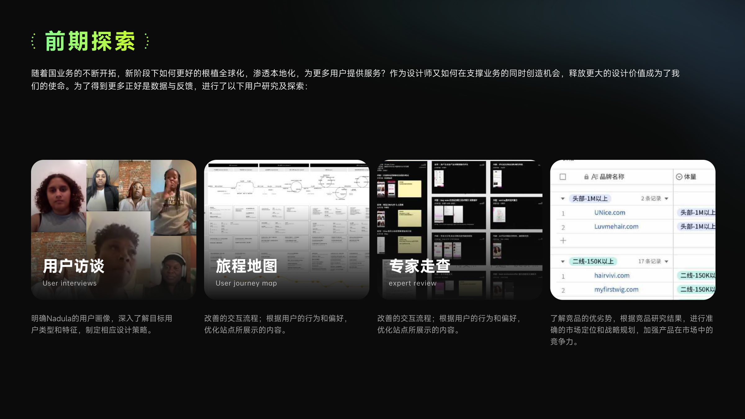
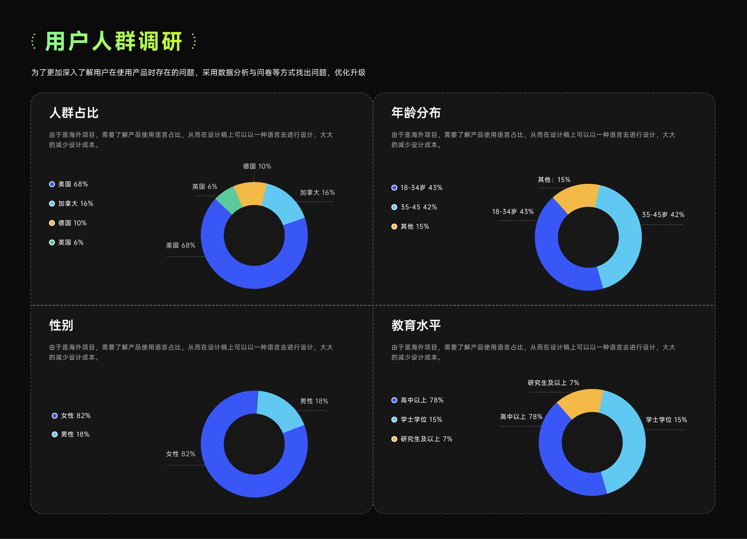
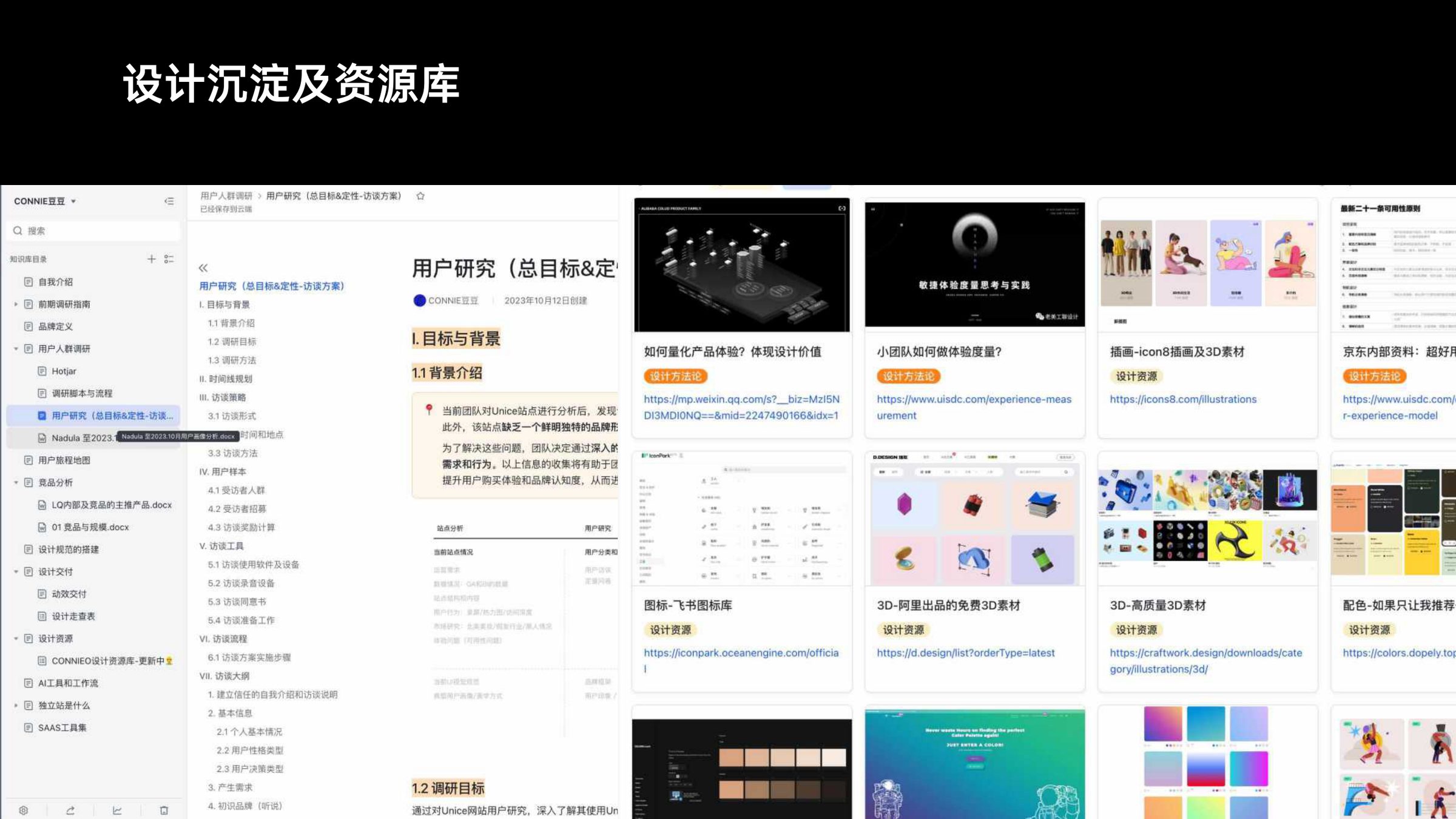
01 — Research
From gut feeling to evidence
Interviews, journey maps, expert walkthroughs and competitor audits — four lenses that agreed: usability, aesthetics and distinctiveness were all under-served.
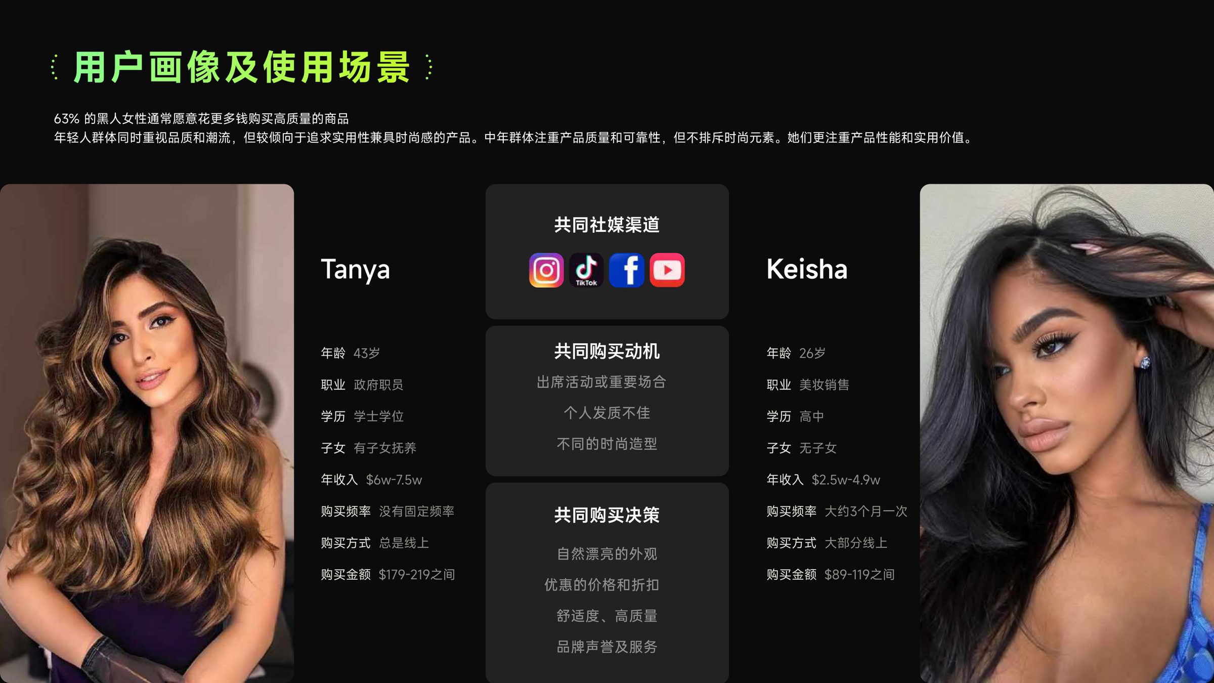
02 — Audience
Who we are designing for
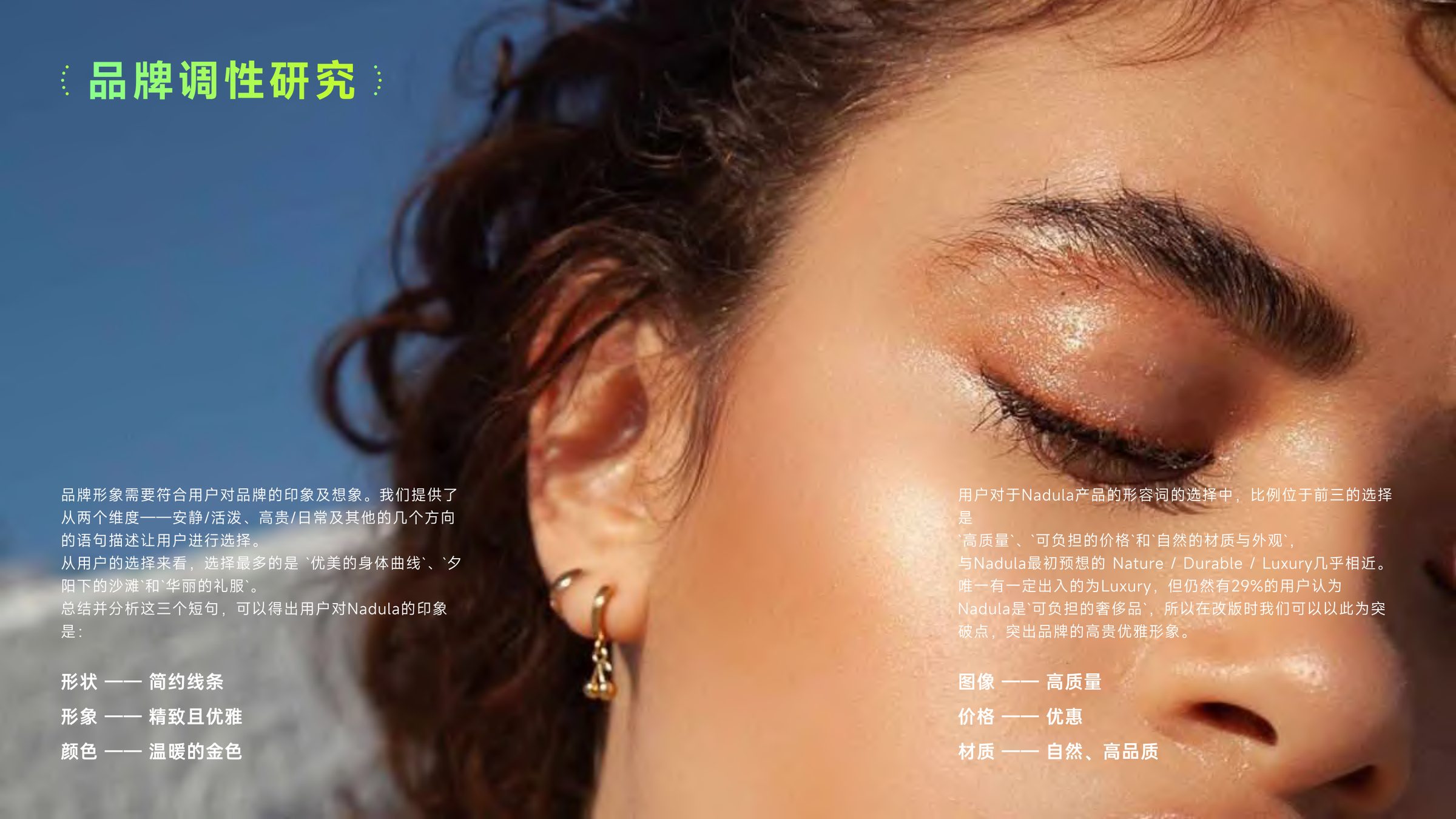
Two personas — Tanya and Keisha — sharing social channels and motivations, but with different price sensitivity and style confidence. The brand tonality test surfaced 'affordable luxury' as the single most resonant positioning.
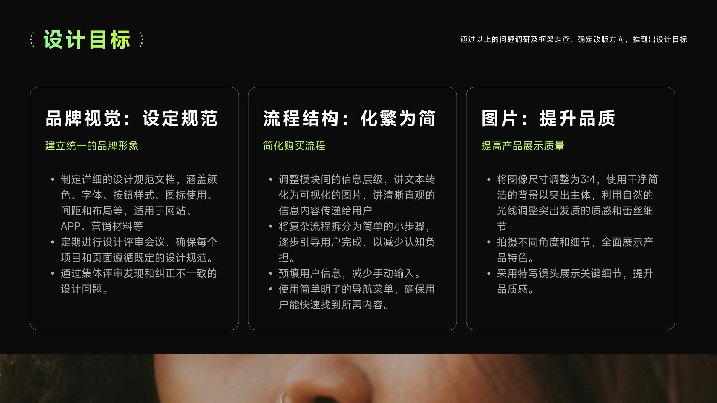
03 — Brand system
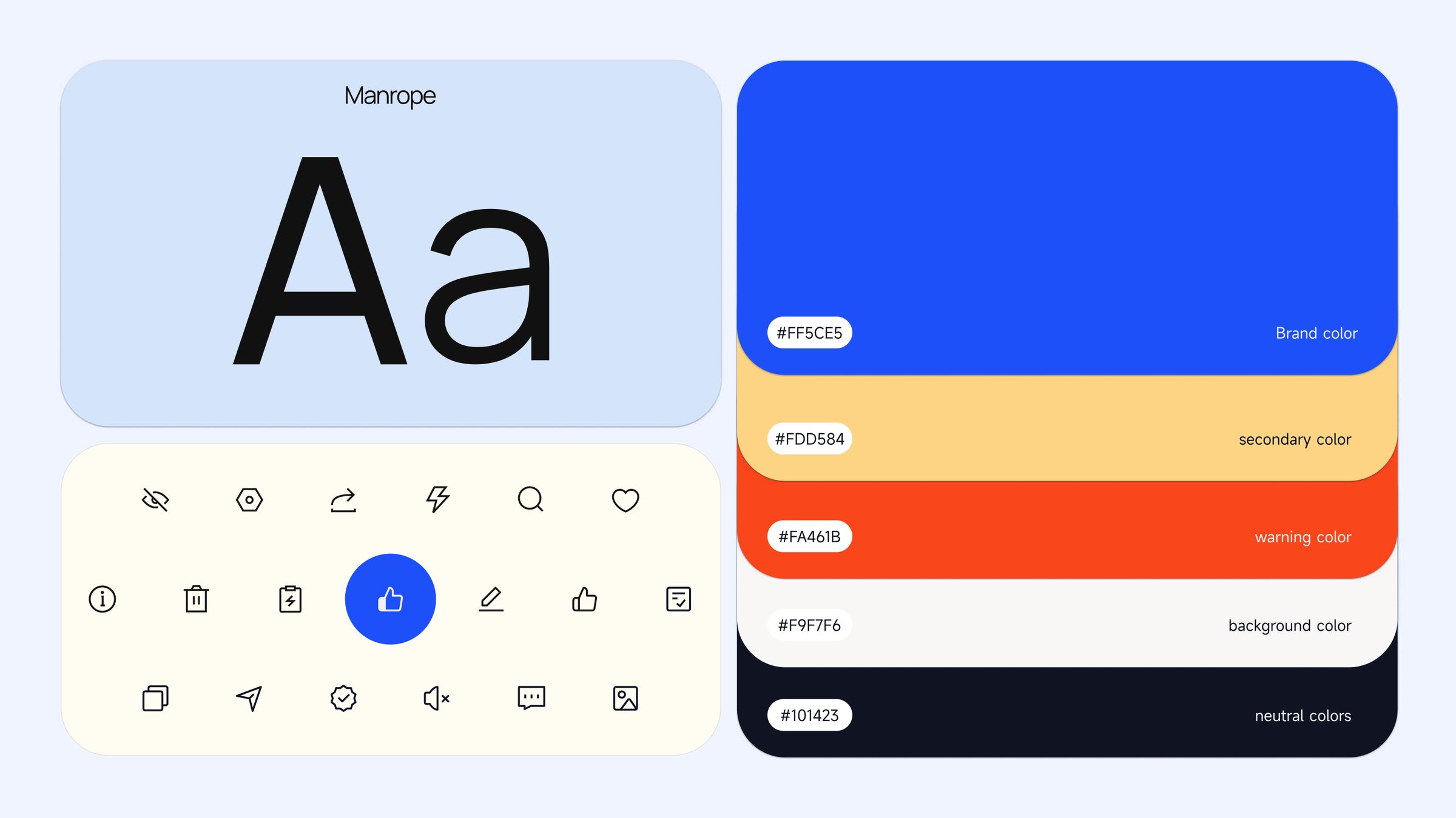
One language across every surface
Warm gold primary, Manrope headings, disciplined neutrals. The system covers web, app, email and marketing — so new work inherits brand equity instead of diluting it.
04 — Home & flow
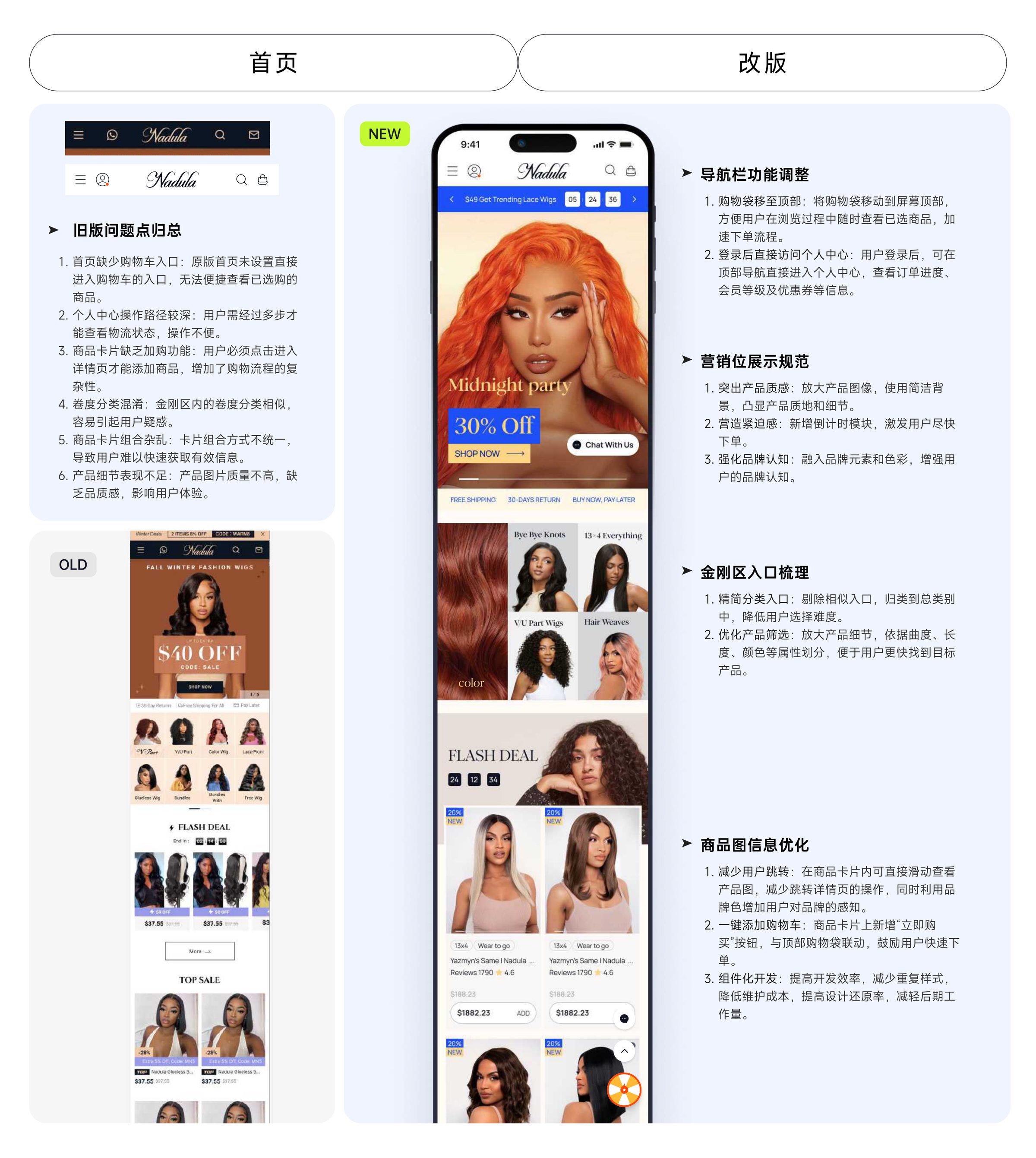
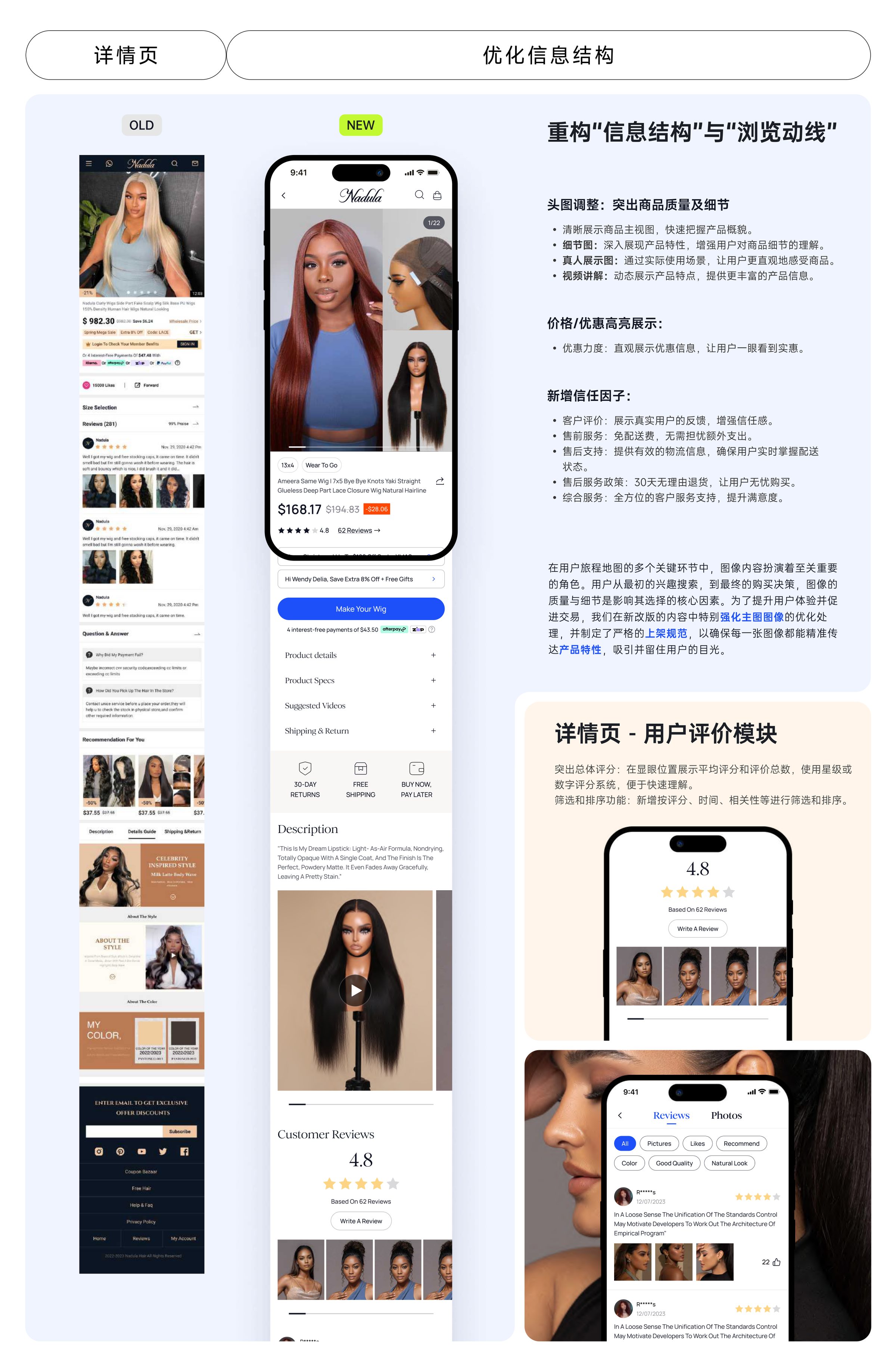
Cut the distance from landing to checkout
Navigation carts moved top-right, category icons rebuilt, PDP added inline swipe galleries and one-tap add. Key information sits in the first screen; the rest of the page is permission to keep reading, not a list of chores.
05 — AIGC ops
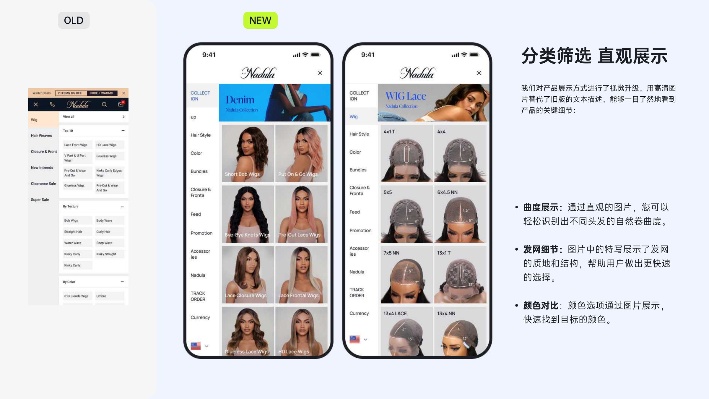
2,000+ product images in two weeks
I piloted an AIGC re-shoot pipeline for the product catalogue — same SKU, cleaner background, consistent lighting, 3:4 ratio. Two weeks, 2,000+ images, a reported RMB 200K+ in saved photography budget, and the first brand-aligned visual unification of the PDP in the company's history.
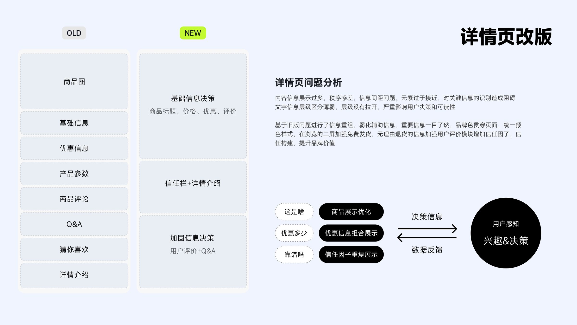
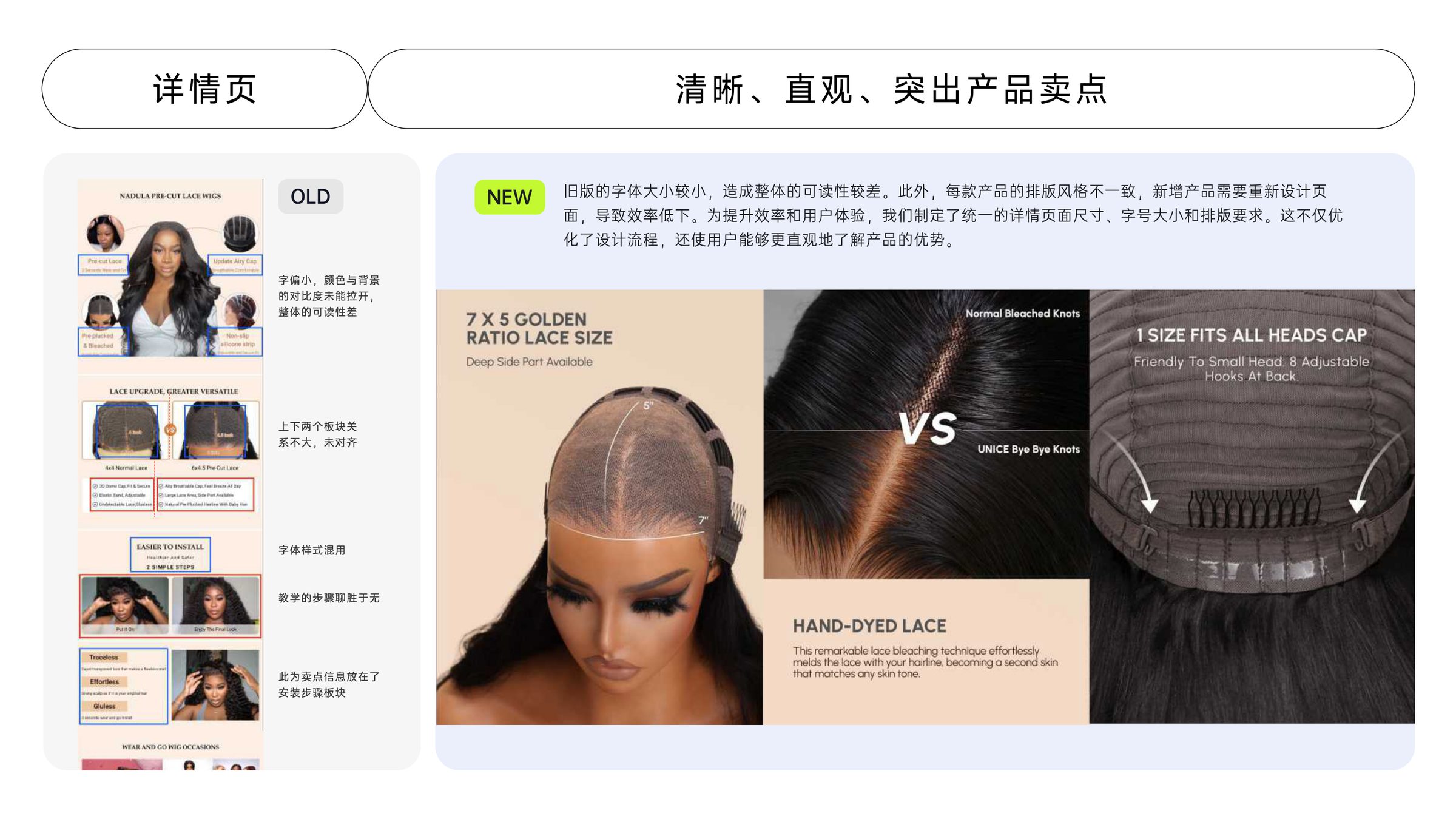
06 — Product detail page
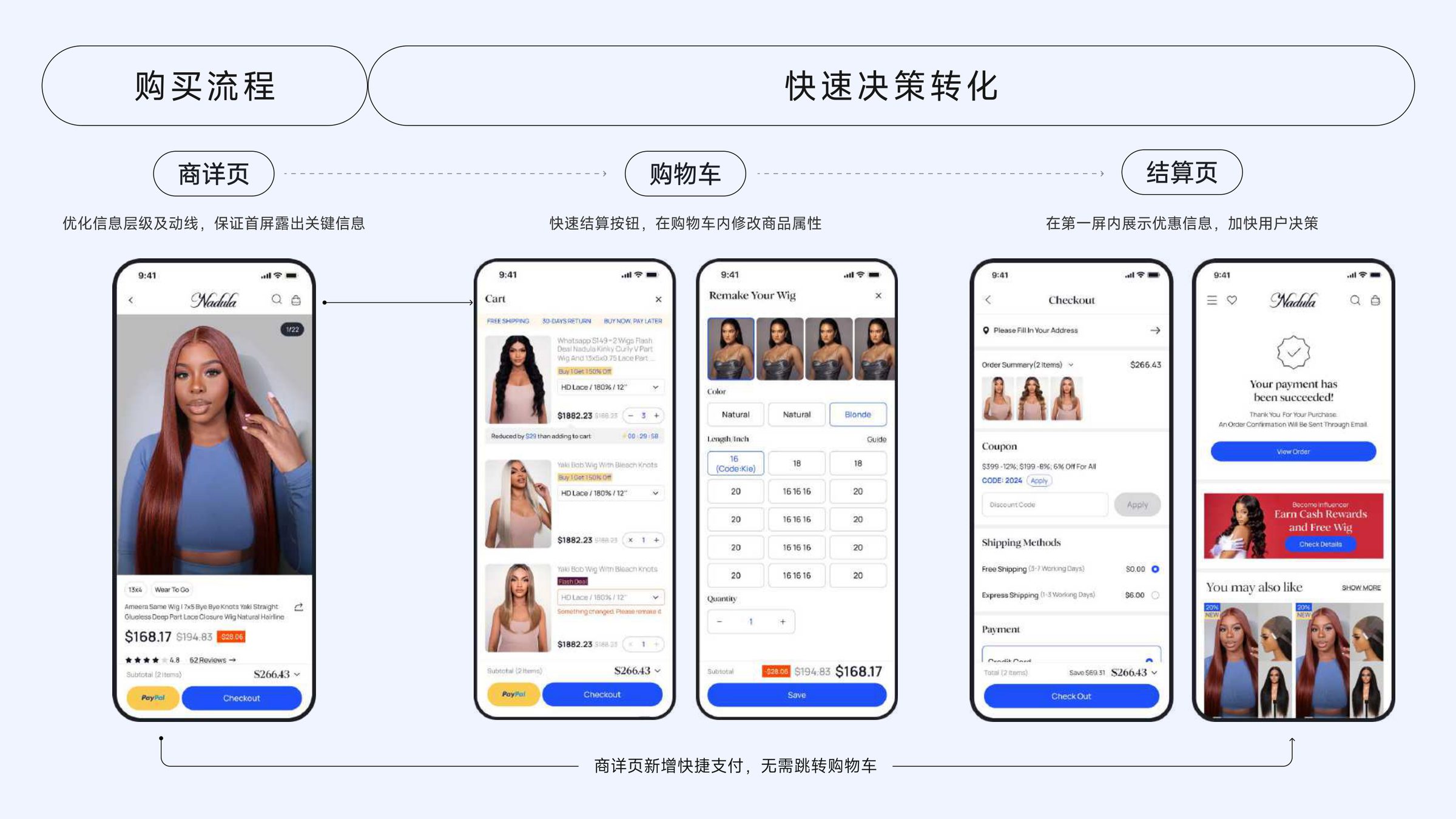
Rebuilt around trust and decision
The old PDP was an information dump. I re-sequenced the page around the three questions the user is actually asking — what is it, what's the deal, is it legit — and injected trust factors at every inflection point: real reviews, free-shipping strip, 30-day return.
07 — Post-purchase
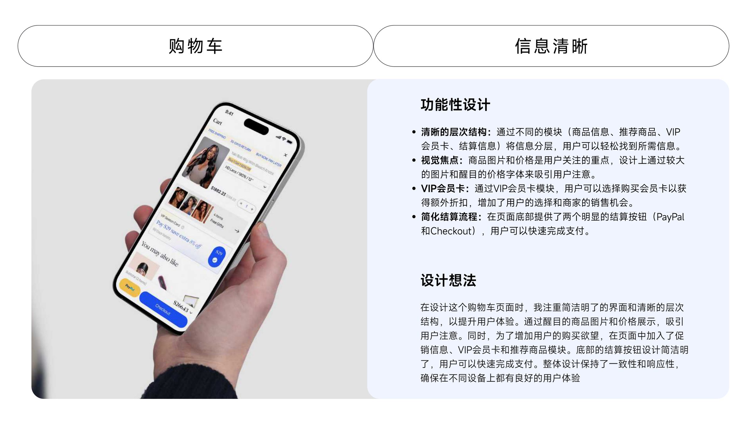
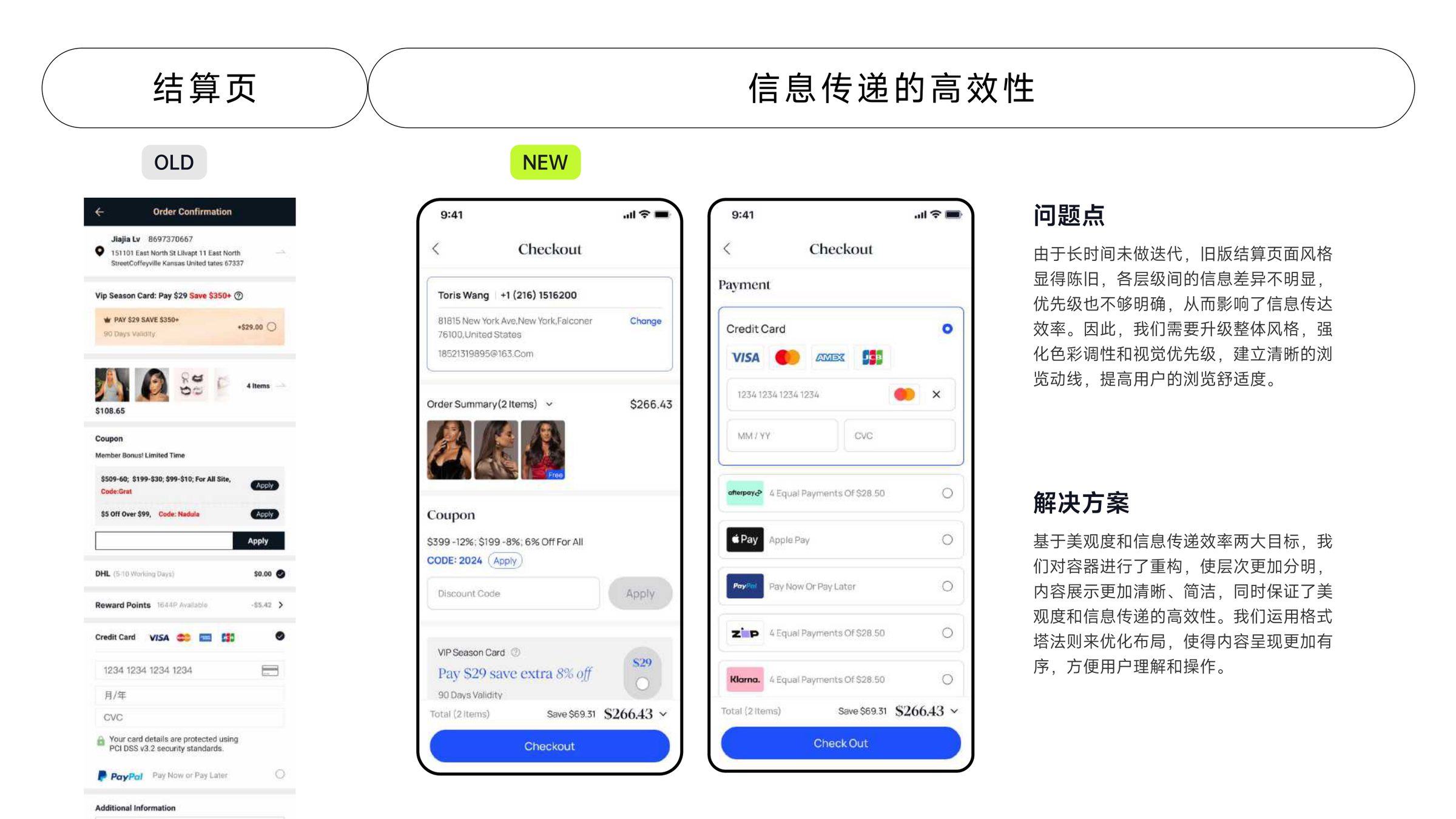
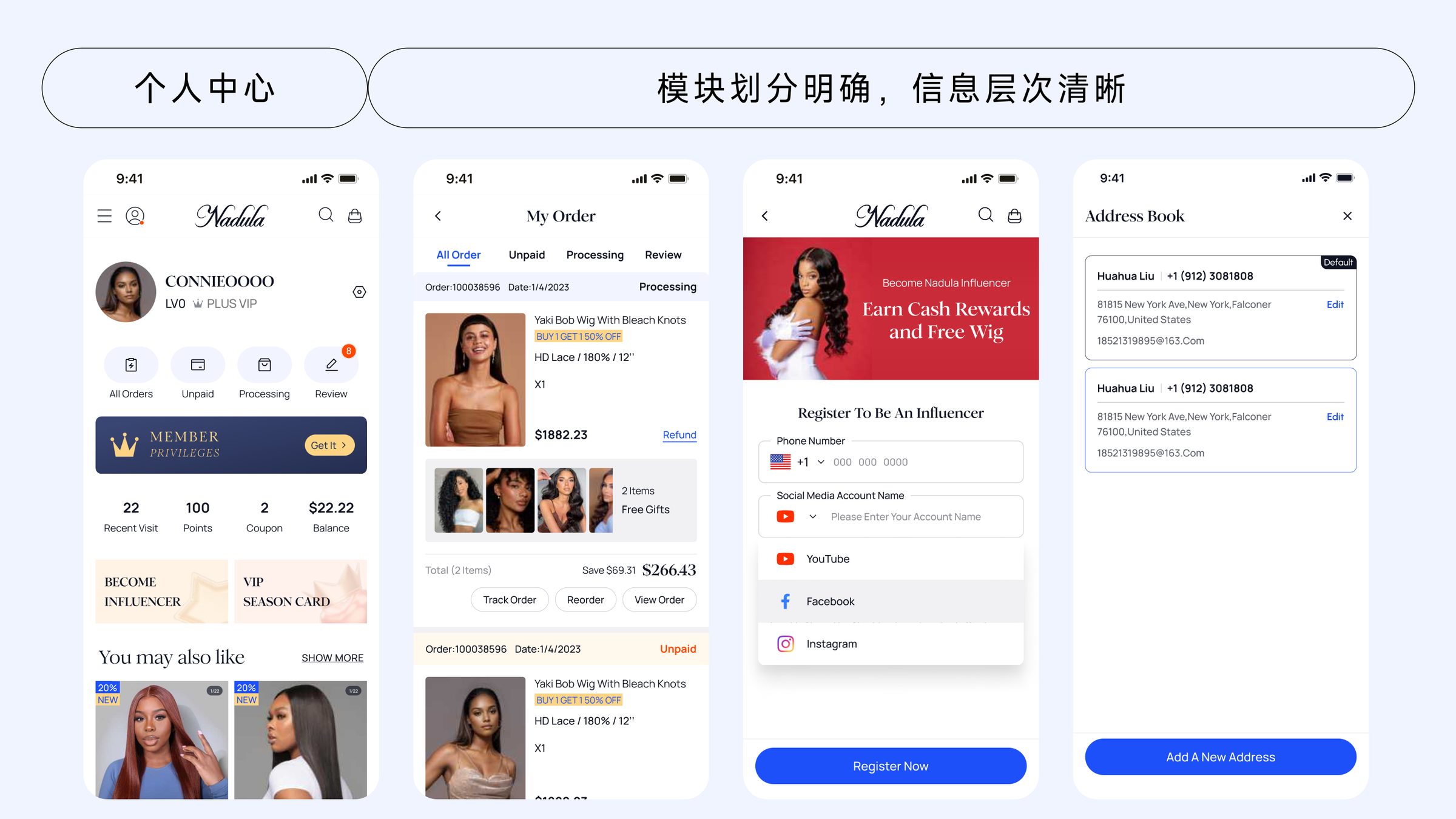
Cart · Checkout · Member center
The sequence after 'add to cart' is where confidence is earned or lost. I redesigned cart, checkout and member centre as a single continuous system — clear hierarchy, predictable actions, obvious progress.
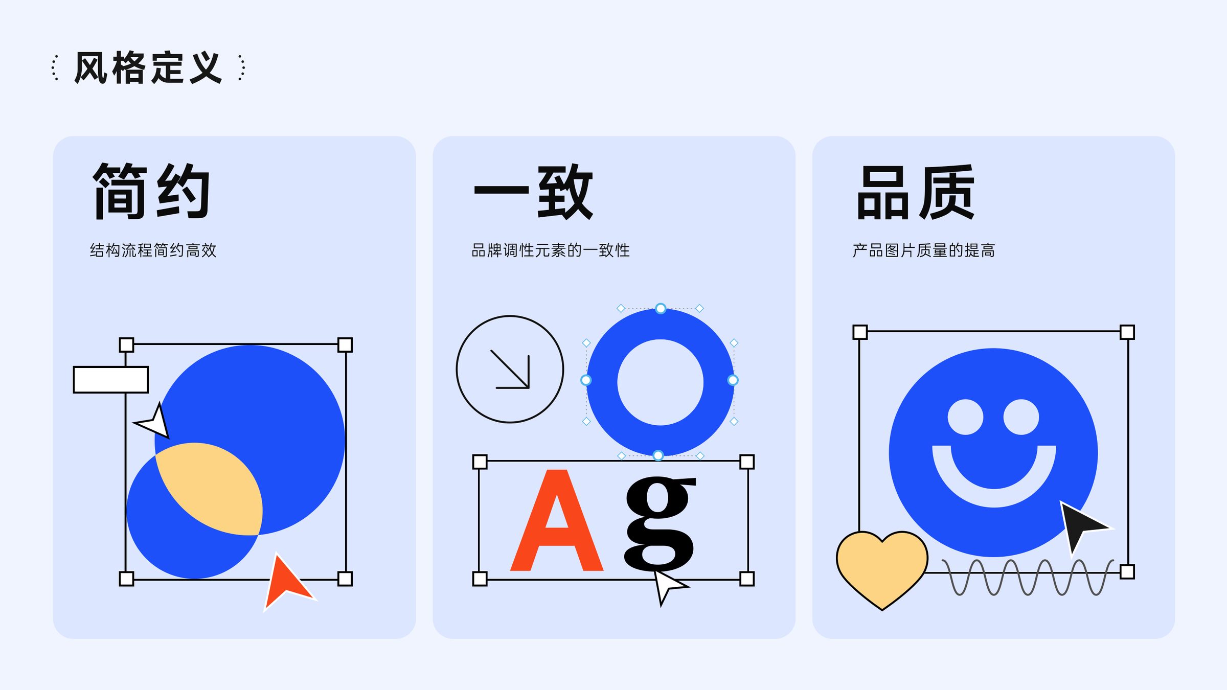
08 — Design system
300+ pages, 60+ components, 3 weeks
A genuine component library — tokens, primitives, patterns, documentation — shipped alongside the redesign. Team onboarding sped up, visual drift stopped, campaign teams could assemble pages without design review for most routine work.
Action
Key design moves
- 01
Three words as the single filter
Every redesign has a hundred tempting detours. I gave myself one rule: a change has to move the work further along simplicity, consistency, or quality — and I refused to accept "it looks nice" as a reason. That discipline is why the final site reads as one piece instead of eight teams' opinions.
- 02
AIGC as an operational tool, not a demo
Most teams treat generative imagery as a novelty. I pushed to use it as a supply chain fix — re-shooting a catalog at scale, under one brand recipe, repeatable. The output isn't "AI-looking"; it's just a properly photographed catalogue. That distinction is what let the savings be real (RMB 200K+) and what let the brand tone finally feel unified.
- 03
Trust factors live at decision points, not in a sidebar
Free-shipping strips, 30-day return guarantees, and real reviews usually hide in side widgets. I put them exactly where the user hesitates — above price on PDP, above the CTA in checkout, in the empty state of the cart. Each reassurance earned its pixels by appearing the instant doubt does.
Results
What changed — and how design earned it.
01
User & business outcome
The redesign pulled a fragmented, marketplace-feeling site back into a recognizable brand. Three teams that used to ship in parallel with no shared visual rules now build against one system. The company's first coherent brand surface — after seven years of accretion — was this project.
02
How design delivered
A small, disciplined design system plus a production-scale AIGC image pipeline did most of the heavy lifting. The system made consistency cheap; AIGC made quality affordable. Together they flipped the unit economics of design inside the company.
03
Leverage for the team
- 01
User satisfaction lifted 12.2% post-launch; product image CTR up 15.6%.
- 02
Delivered a 60+ component design system, covering 300+ pages within 3 weeks of rollout.
- 03
AIGC image pipeline re-shot 2,000+ SKUs in two weeks, saving 200K+ RMB in photography budget — a first in the category.
- 04
Earned two internal honour certificates for cross-team design leadership.
Narrative — Reflection
What this project leaves me with.
The most durable thing I built on NADULA wasn't a page — it was a filter. Three words, applied to every request that came in. That filter outlasts me; the pages don't.
The second thing I learned is that production tools can be design decisions too. Bringing AIGC into the image pipeline wasn't a "let's try it" moment; it was the unlock that made consistency economically possible. I'll be more aggressive about treating operational constraints as design surfaces from now on.
If I had another six months, I'd close the loop into merchandising — giving category managers a live view of where the system is working and where it's drifting, so quality becomes a standing habit instead of a redesign event.