AI Academic Writing · 0→1 Product
Knowee
Writer
Redesigning the entire academic-writing flow around evidence you can verify.
00 — Overview
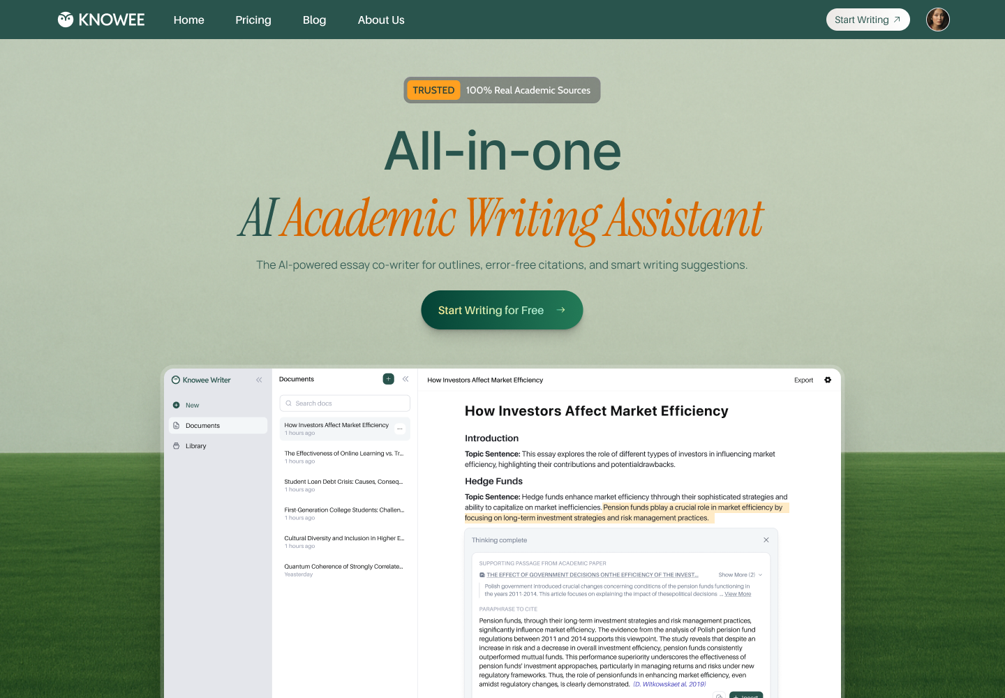
Project Overview
A writing space that finally unifies writing, citation, and literature research.
Knowee Writer is an AI academic-writing assistant already used across 1,000+ universities. It pairs intelligent writing with 100% real, verifiable citations — closing the gap between “AI reads fluently” and the rigor that academic grading actually rewards.
ProductKnowee WriterAI academic writing assistant
My RoleEnd-to-end UX/UIResearch → Launch → Iterate
Core SurfacesEditor · Library · ChatPDFWeb + browser extension
Design FocusTrust & workflowWriting and citing in one breath
01 — Background
Background
General AI can write, but you can't trust its citations.
To write one paper, a student juggles four tools at once — a doc for prose, Google Scholar for sources, a reference manager to organize, and a PDF reader for the originals. AI was supposed to help, but by “inventing citations that don't exist” it only made things worse.
General AI's fatal flaw
Tools like ChatGPT produce confident, fluent text, yet frequently “hallucinate” fake references, page numbers, and DOIs. In an academic context, a single fabricated citation can sink an entire paper. Students end up spending more time fact-checking the AI than it ever saved them.
A fractured workflow
Writing in one app, searching in another, organizing in a third, reading in a fourth. Every switch breaks focus — and snaps the thread between a claim and the evidence meant to support it.
15–20h
Average time per paper, from research to final draft
4
Disjointed tools juggled in a single writing session
100%
Of general-AI citations need manual re-verification
1000+
Universities the product later reached
The hard part was never putting words on the page — it's producing, for every sentence, a source you don't have to keep doubting.
02 — Research
User Research
Listening to how students actually write.
I interviewed undergraduate and graduate writers (many of them non-native English speakers), mapped their end-to-end workflow, and took apart the competition — ChatGPT, Jenni, Grammarly, Zotero — to find every point where a tool “stops helping.”
01
The trust gap
Students are both excited and afraid of AI — especially its citations. Most verify every reference by hand, spending back the very time the AI was meant to save.
02
Worn down by switching
Write → Scholar → reference manager → PDF reader → back to writing. The constant tab-switching is the biggest source of friction and lost focus.
03
Blank-page dread
The hardest moment isn't writing a sentence; it's building structure. Many stall at “outline” and at “expanding a topic sentence into a paragraph.”
04
The fluency barrier
Non-native speakers know their ideas but stall on academic phrasing and flow, slowing down sentence by sentence.
03 — Challenges
Design Challenges
Four tensions that needed resolving.
01
How do we make AI citations trustworthy?
The whole product rests on this. Evidence must come from real academic databases — presentable, traceable, verifiable — never “generated.” Trust itself is the core feature.
02
How do we fit four tools onto one screen without suffocating it?
Writing, search, reference management, and PDF reading must coexist — without turning the editor into a “cockpit” crammed with panels and buttons.
03
How can AI help without breaking flow?
Help has to appear exactly where the writer's attention already is — on call, ignorable — not parked in a sidebar you have to detour to.
04
How can a blank canvas be both calm and powerful?
The editor should open as quiet as a blank sheet, yet keep real capability one keystroke away the moment it's needed.
04 — Decisions
Design Decisions
The key decisions that shaped this product.
Every challenge eventually lands on one concrete interaction. Below are the designs that actually shipped — and the trade-offs behind them.
Decision 01
Make the workflow legible the moment you walk in
The sign-in uses a split screen: the shortest possible login on the left (one-tap Google or email), and a carousel on the right that tells the core value frame by frame — “Your AI academic co-author,” “Outline, edit, cite — end to end,” “Save 50% of your writing time.” It sets expectations and trust before the user commits.
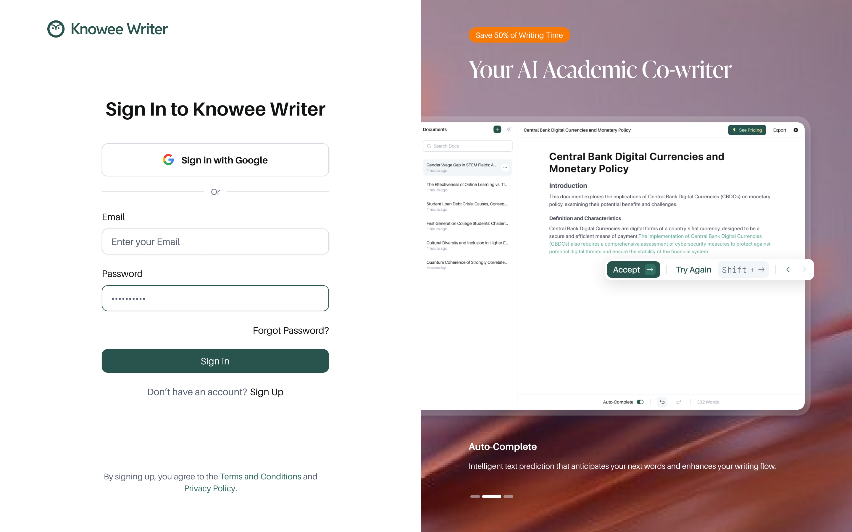
Split sign-in: a minimal entry on the left, a value carousel on the right.
Decision 02
No blank page: ask intent first, then hand over a skeleton
To counter blank-page dread, writing doesn't start from nothing — it starts from a single intent. A prompt, “What do you want to write?”, collects the need and generates a complete, logically ordered outline in seconds. The editor that follows stays quiet — just type “/” to summon Ask AI, Outline, Organize Paragraph, Sub-Points, and Citations right where you are.
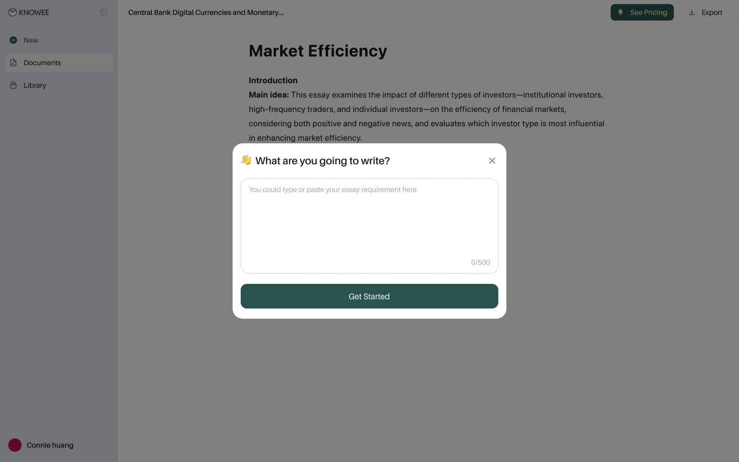
① Ask intent first, instead of facing a blank page.
② A complete outline in seconds.
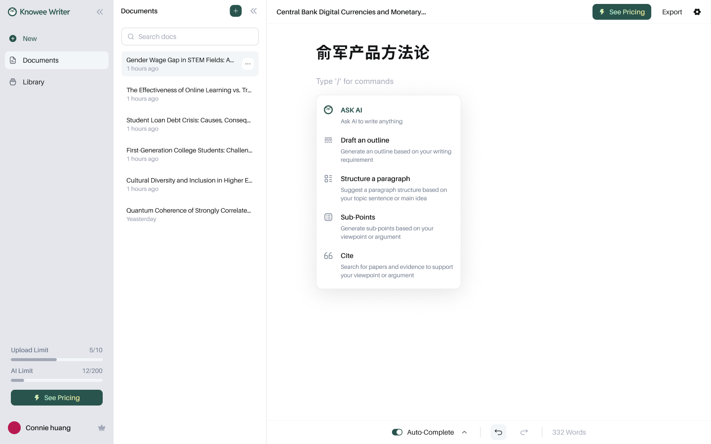
③ Summon AI anytime with “/”.
Decision 03
Cite from real literature — powered by Deep Research
This is the core trust feature. The writer pastes in a claim, and Knowee searches real academic papers across All / Discover / Library, showing citation counts, authors, and abstracts. Deep Research goes further — pulling the exact passages that support the claim and offering sourced, one-click-insertable rewrites. Nothing is made up.
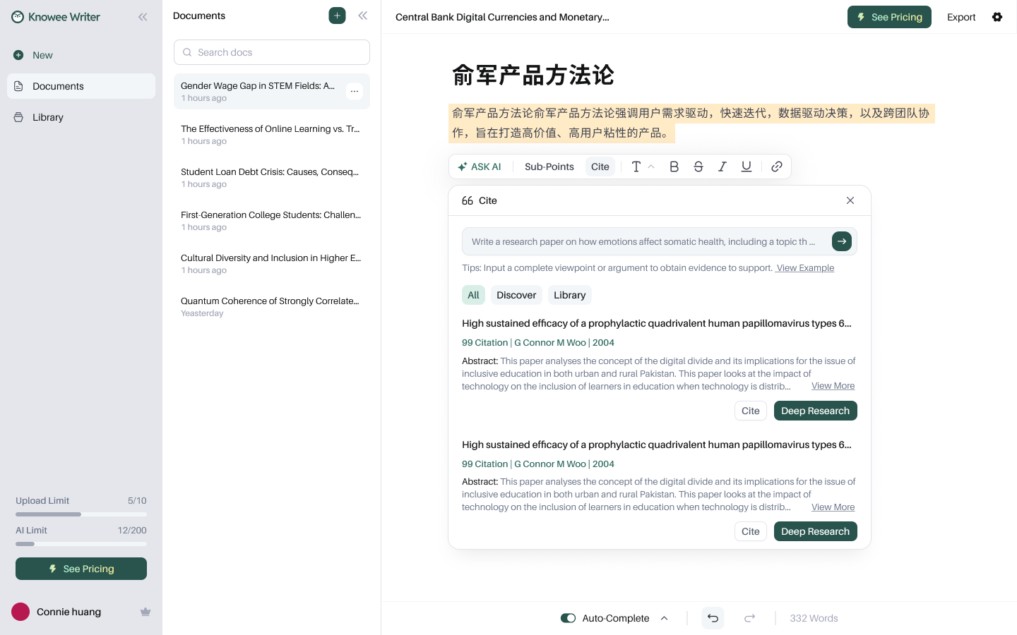
Real search results with citation counts and abstracts.
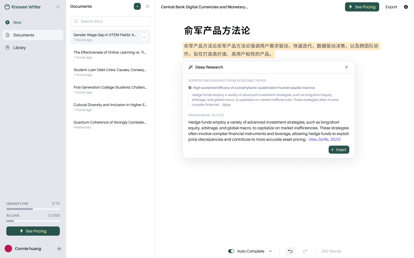
Deep Research: supporting passages → sourced, ready-to-cite rewrites.
Decision 04
Keep citations “alive” in the draft: traceable, reformattable
An inserted citation isn't dead text. Hover any inline citation to see source details, jump straight to the original with Open PDF, switch between narrative and parenthetical styles, or delete it. The full reference list is generated automatically and switches in one click across APA 7 / MLA 9 / Harvard / IEEE / Chicago — exactly the most tedious, most automatable part of academic writing.
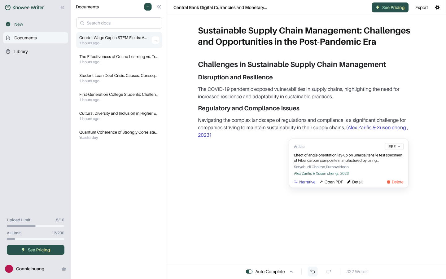
Hover a citation to trace it, switch styles, or open the PDF.
References auto-generated; five citation formats in one click.
Decision 05
A selection toolbar that “thinks like a writer”
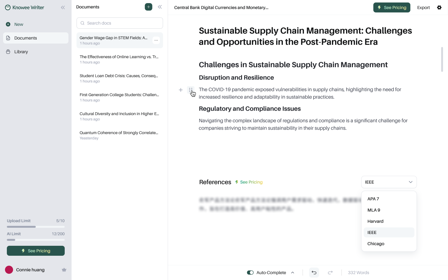
Select any text and a contextual toolbar appears at once — let AI rewrite, generate Sub-Points, find a citation for this sentence, or adjust formatting and highlight color. Editing and finding evidence both happen exactly where the writer's eyes already are.
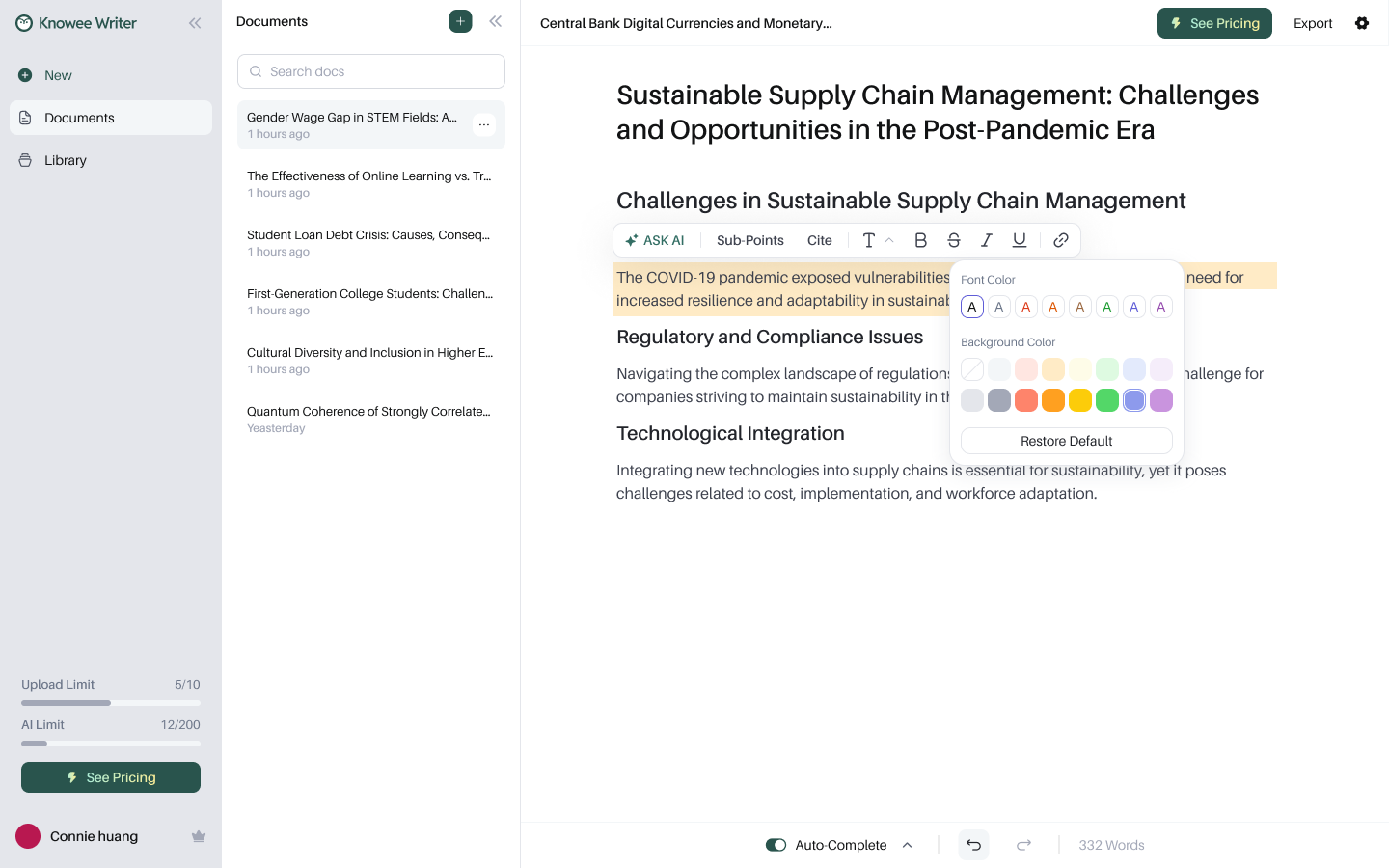
Select to act: rewrite, expand, cite, or restyle in place.
Decision 06
An Auto-Complete that anticipates your next sentence
Momentum matters — especially for non-native writers. Auto-Complete predicts the next sentence in faint text; Accept to take it, Try Again to regenerate, or just keep typing to ignore it. It removes the blank-page stall without ever taking over the writer's own voice.
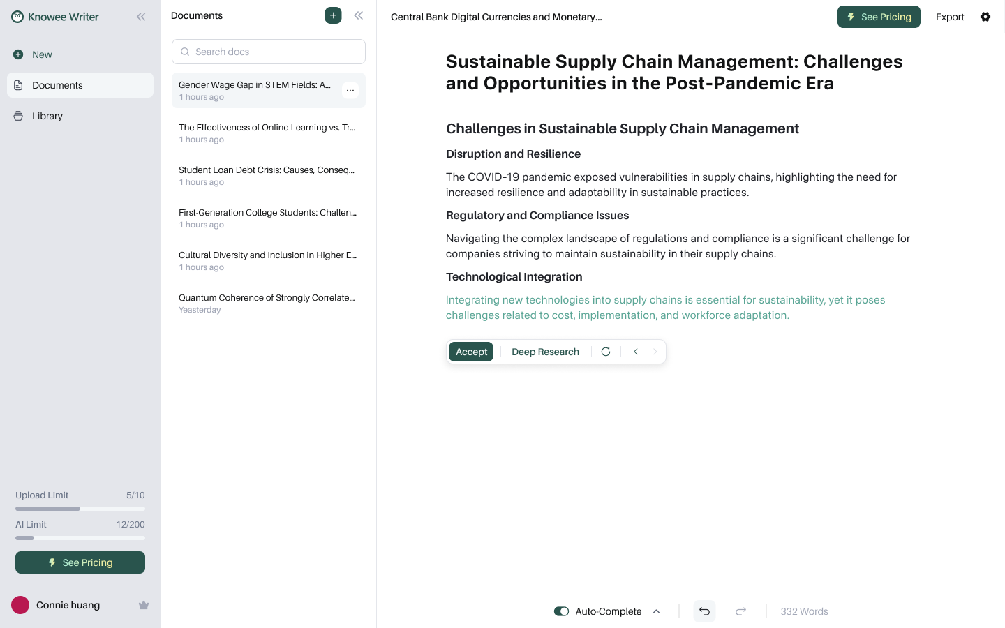
Suggestions are always reversible — accept, retry, or write right past them.
Decision 07
From a topic sentence to a supported argument
“Organize Paragraph” offers structure templates — Problem-Solution, Cause-Effect, Comparison — expanding a single topic sentence into an ordered Cause / Effect / Evidence / Explanation skeleton; Sub-Points then fill in the supporting arguments. Structure first, words second, inserted item by item as you choose.
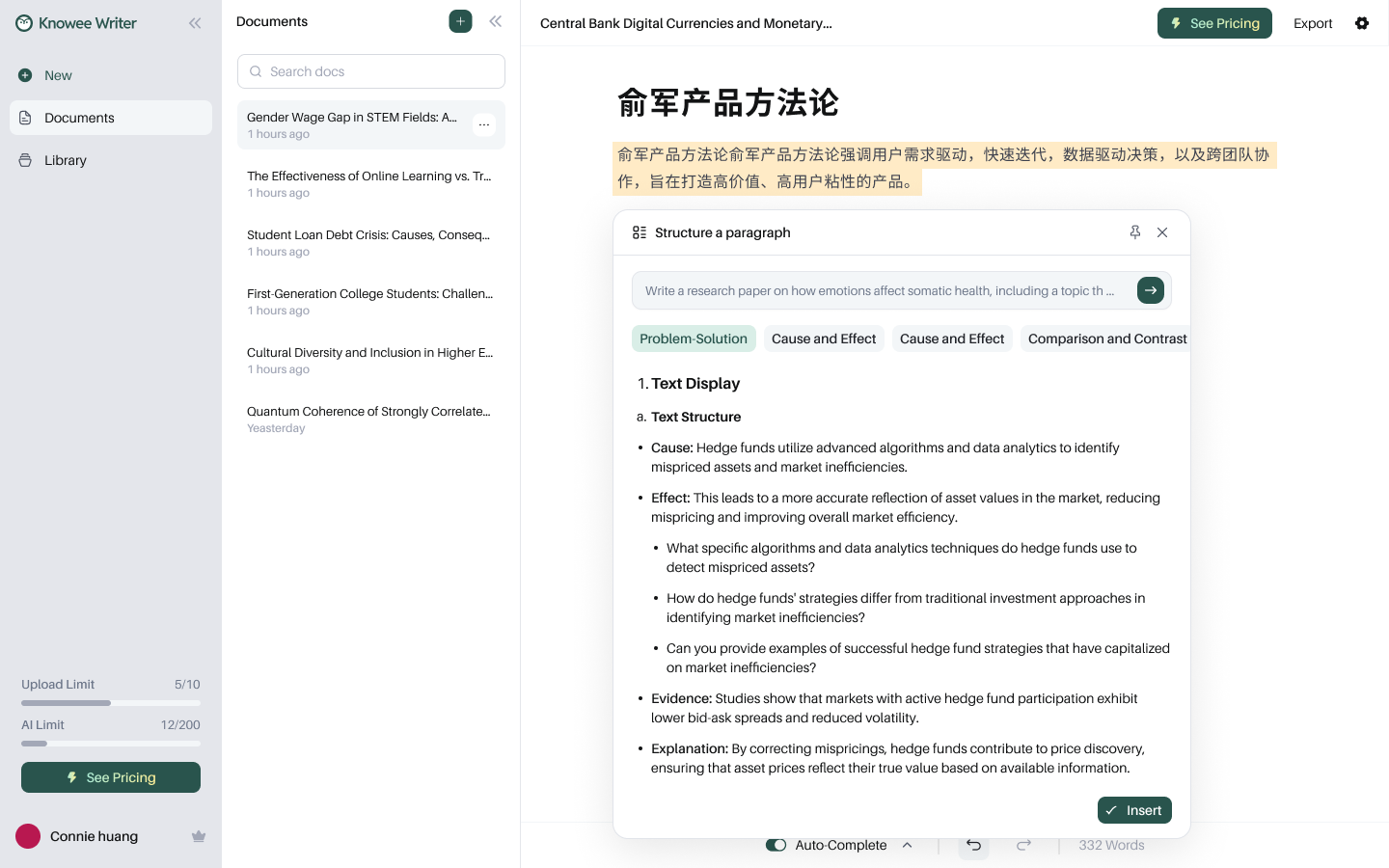
An ordered paragraph skeleton by structure type.
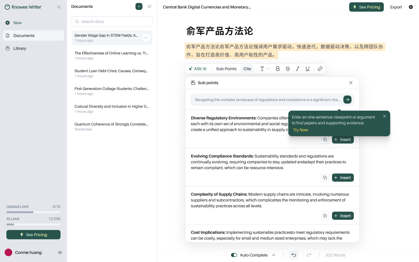
Generate supporting sub-points; insert as you choose.
Decision 08
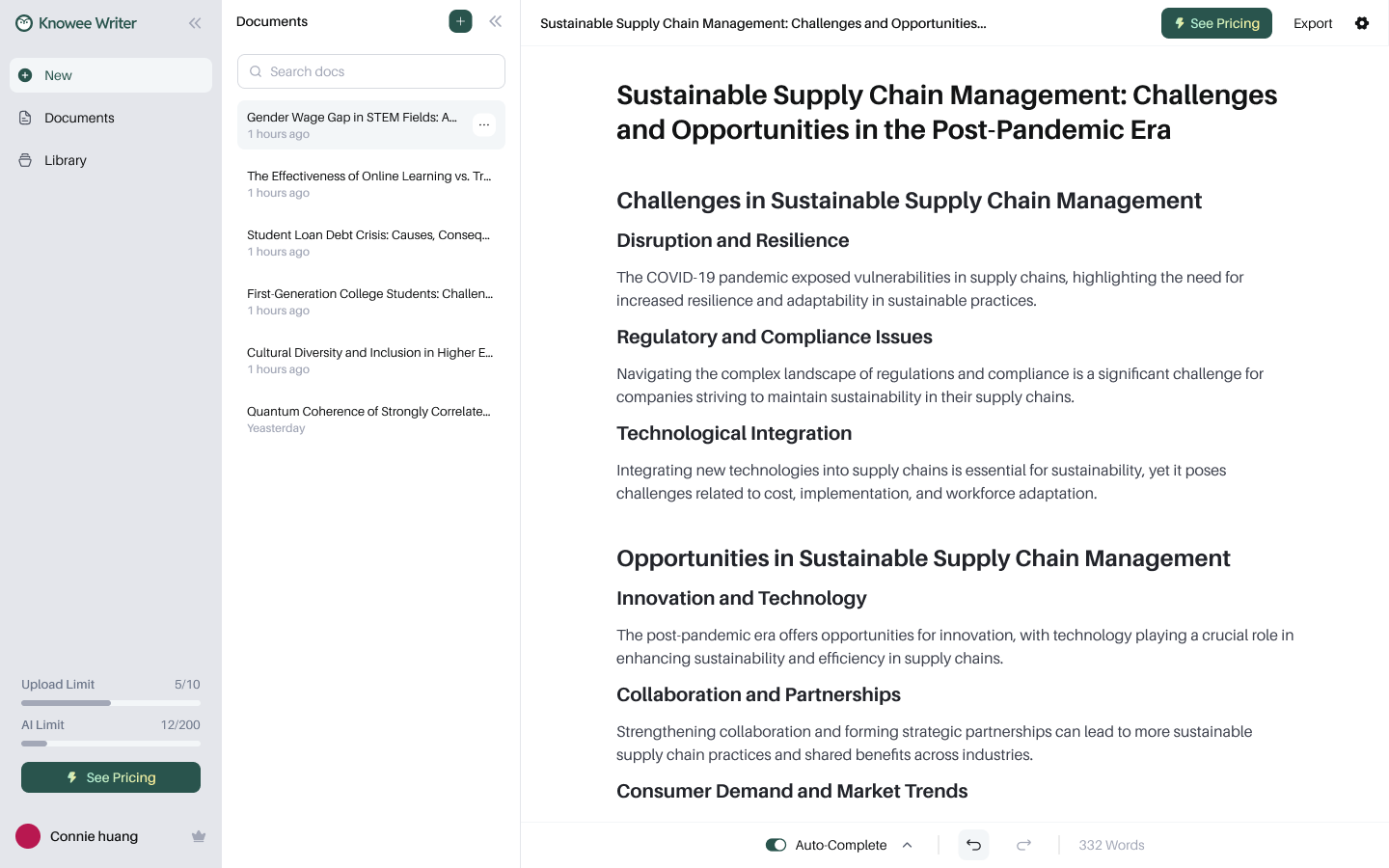
A smart library that reads PDFs with you
Uploaded papers are auto-parsed into structured records — title, authors, DOI, abstract, collections, and tags — turning sources into searchable knowledge instead of a pile of files. ChatPDF opens any paper side by side to summarize and answer questions, and even box-select a figure to ask about it, bringing multimodal reading into the writing flow.
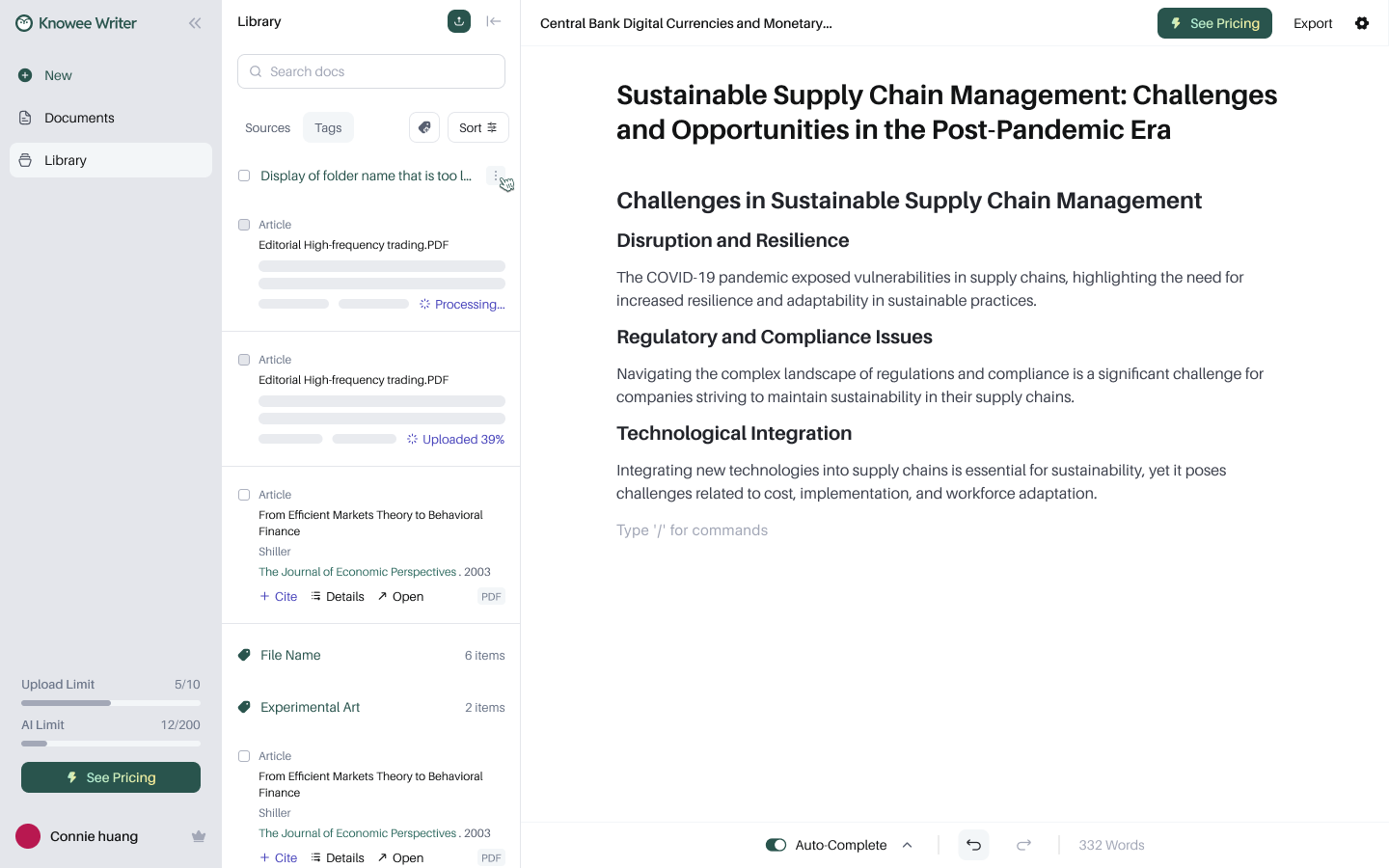
① Auto-parsed on upload, with visible progress.
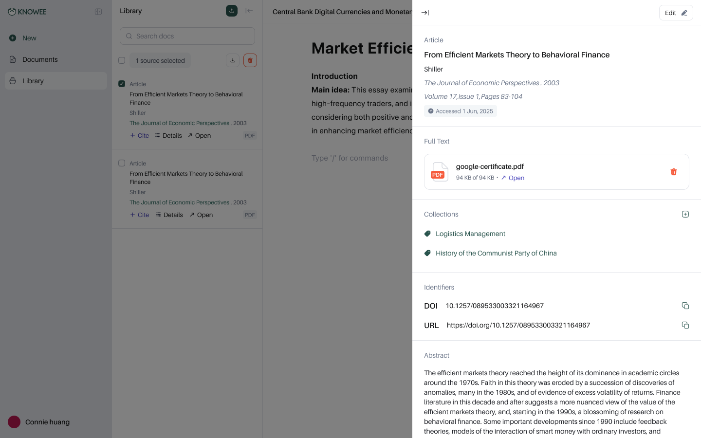
② Each source is a structured, citable record.
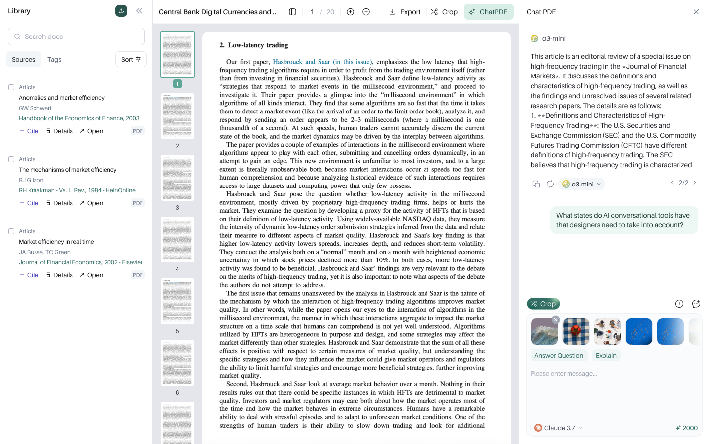
③ Read side by side, ask, and box-select a figure.
Decision 09
Hand control back to the writer
AI isn't a black box. In document settings, the writer decides whether Auto-Complete is on, whether the accept button shows, the default citation format, and — crucially — whether auto-citation may draw “from external sources / from my library.” Always knowing what the AI cited on your behalf is where trust lands in the details.
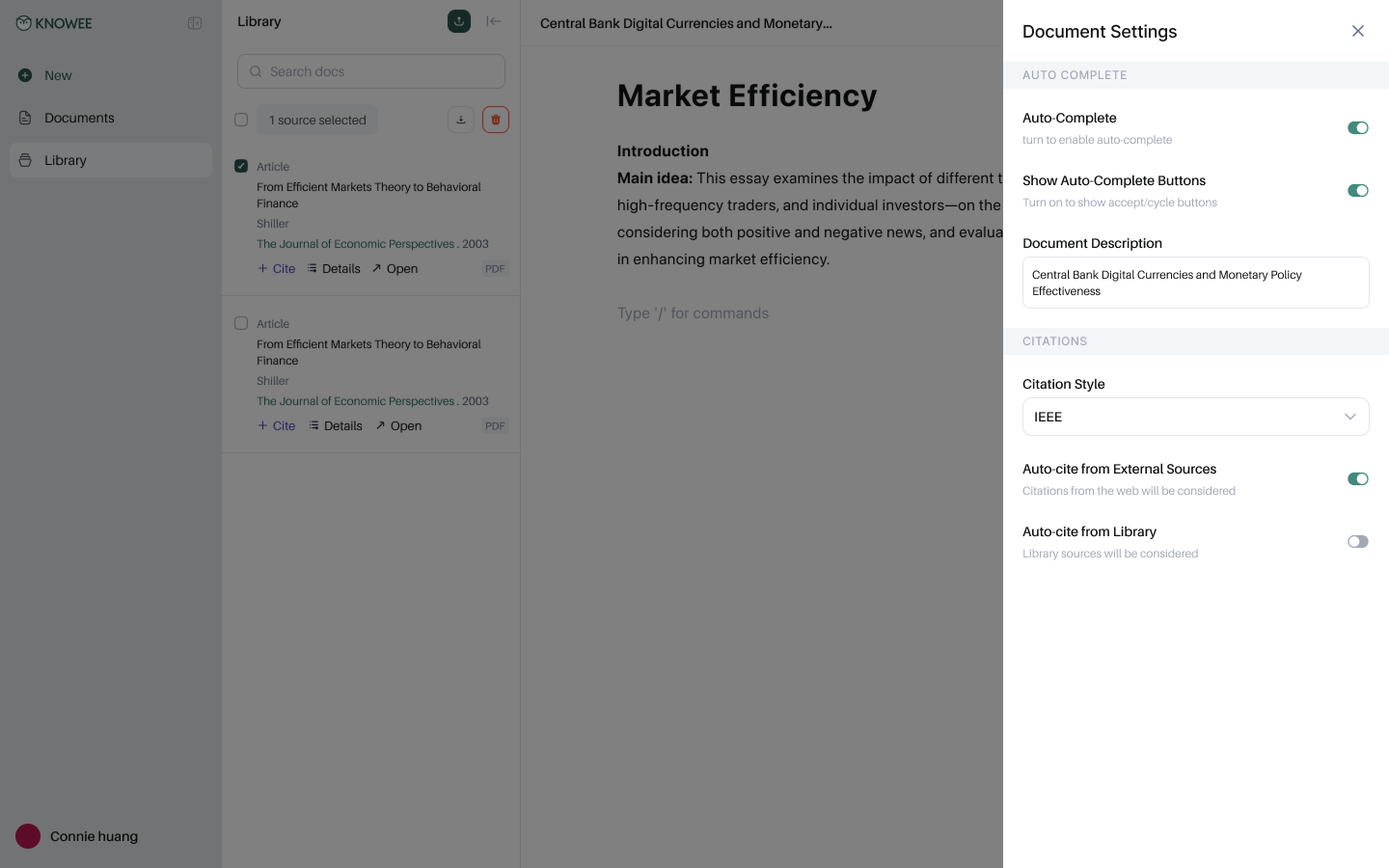
Per-document control: auto-complete, default citation format, auto-citation sources.
Decision 10
A paywall designed around value, not limits
The upgrade moment opens with the upside — “save 15–20 hours per paper,” real citations, unlimited AI help — and anchors monthly against annual. It converts by reminding you what you're about to gain, not what you've been blocked from.
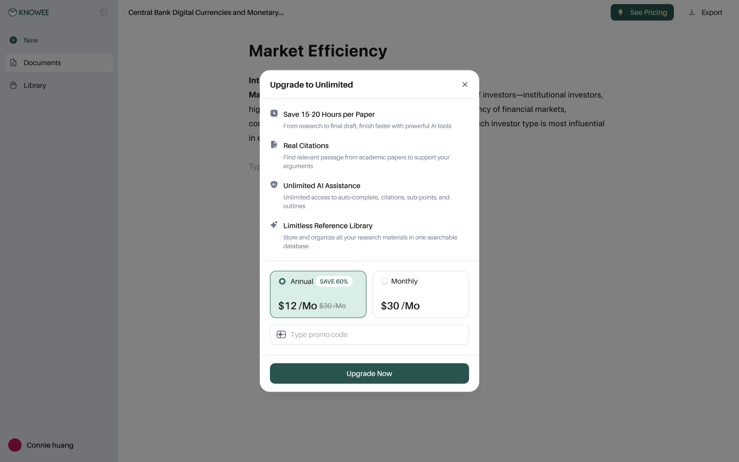
A benefits-first upgrade page with clear annual/monthly anchoring.
Decision 11
Research anywhere — the Chrome extension
Research doesn't only happen in the editor. The Knowee extension floats over any webpage or PDF — Chat, Write, Quiz in the sidebar, plus box-select-to-ask on any region — so writers can grab evidence and answers on the spot and bring them back to their draft.
The extension brings Knowee's help to any page on the web.
05 — Results
Results & Reflection
From a tangled mess to finishing a paper in one sitting.
Once the four tools were gathered into one trustworthy flow, what used to take days now fits inside an afternoon.
~8h
To write a whole paper, from research to draft
15–20h
Saved per paper versus the old flow
1000+
Universities the product reaches
3s
To generate a complete, logical outline
What went right
- “Real citations” were the wedge — trust, not fluency, drove growth and retention.
- The in-place “/” command kept the editor quiet while keeping power discoverable.
- Bringing PDF reading into the canvas removed the heaviest context switch.
What I'd push further
- A guided first-run — features this deep deserve a stronger onboarding moment.
- Reading and annotation on mobile and tablet, not just desktop writing.
- Lightweight collaboration for co-authored papers and advisor feedback.
06 — Contribution
My Contribution
What I owned.
I led the design end to end — from the first interviews to a shipped, continuously iterated product — working closely with product and engineering.
Research & Strategy
Ran user interviews and competitive teardowns, defined the IA, and established “trust” as the product's core wedge.
Editor & AI Interaction
Designed the “/” command system, the selection toolbar, and the in-flow Auto-Complete interaction.
Citations & Deep Research
Partnered with engineering to refine how real sources, citation counts, and sourced rewrites are shown and inserted.
Library & ChatPDF
Designed structured reference records and the side-by-side, box-select-to-ask multimodal experience.
Design System
Built a brand-led component library — forest/cream palette, type rules, and patterns reused across surfaces.
Growth & Conversion
Designed value-framed paywall and upgrade flows, iterating activation with product and data.